
Colour in Screen Printing: 10 Questions Brands Ask Before Ordering Custom Prints

Published
Colour is usually the first subject brands ask about when they see a screen printing quote. How many colours can we print? Will it match our logo exactly? Will it look right on a black t-shirt? Can you follow our brand guidelines? This guide answers the 10 questions about colour in screen printing that we are asked most, with real examples from our own print floor.
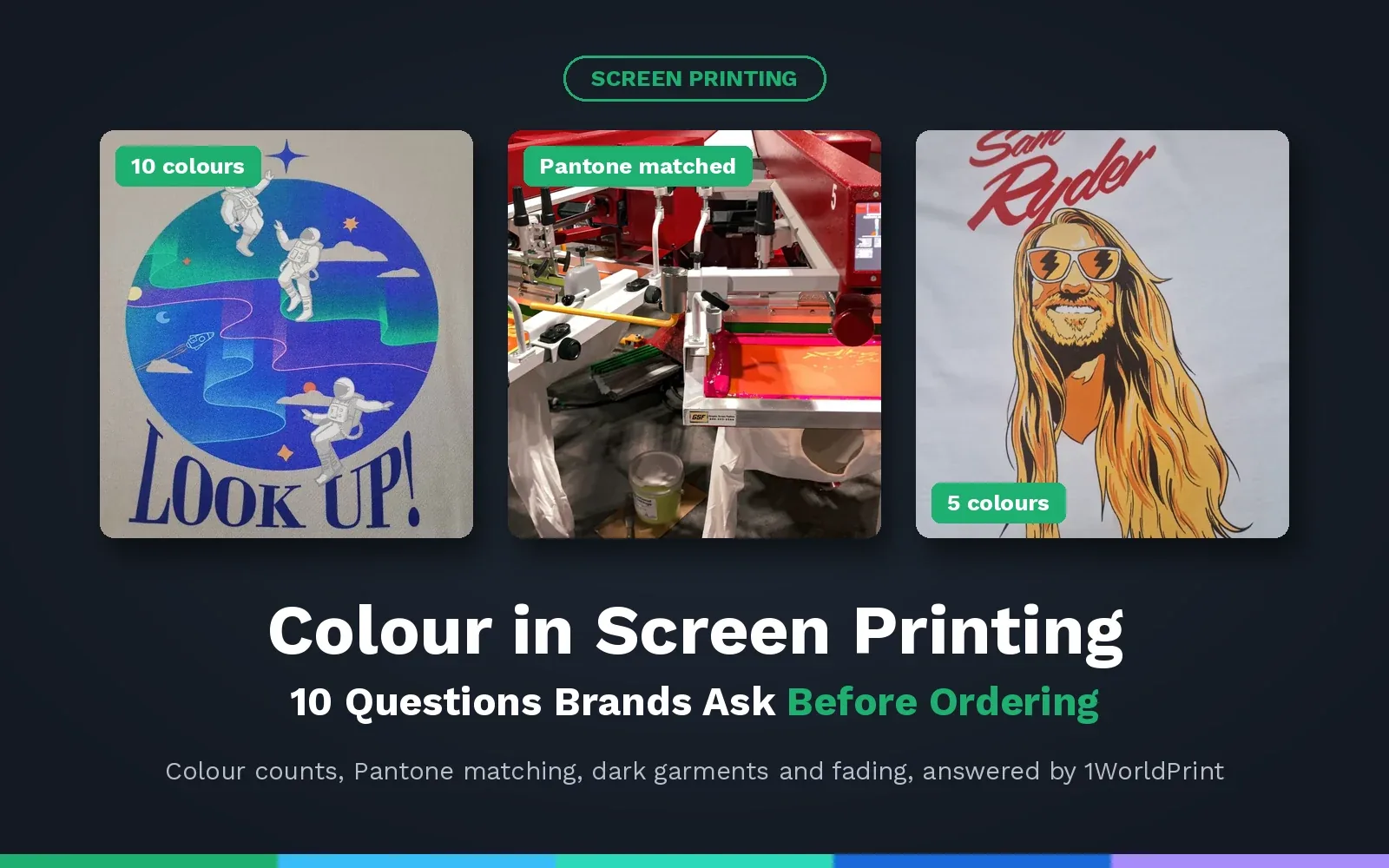
Screen printing creates an image one colour at a time, with each colour squeezed through its own fine mesh screen and then heat cured through an industrial dryer. That is what gives screen printed colour its strength, identity and long life, and it is also why your colour choices affect both the price and the finished product. Understanding them before you order means better prints and no surprises on the finished items.
Key points
- Each colour in a screen print requires its own screen, so fewer colours will mean a lower price per garment.
- Inks are mixed to your Pantone references, so brand colours match exactly on every order. No surprises or “almost” matching.
- On dark garments we print a white underbase (flash) first to keep colours bright.
- Photographic and full colour designs can be screen printed using full process (CMYK) separations.
- Properly cured screen print ink stays bright through repeated washing, meaning it can be worn for years.
The 10 questions
- 1. How many colours can I have in a screen print?
- 2. Does every extra colour cost more?
- 3. Can you match our exact brand colour?
- 4. What if we do not know our Pantone colours?
- 5. Will colours look the same on black and coloured garments?
- 6. Can screen printing produce photos, gradients and full colour designs?
- 7. Why does my design look different on screen than on the shirt?
- 8. Which inks give the brightest or softest colour?
- 9. Can you print metallic, puff or glow in the dark colours?
- 10. Will screen printed colours fade?
In this guide you will also find a colour checklist to use before you order, how ordering works and more quick answers.
1. How Many Colours Can I Have in a Screen Print?
Short answer: as many as your design needs, but most brand and event orders use one to four colours.
Each colour in your design is printed through its own screen, one after another, so the number of colours is really the number of screens. There is no strict limit, and we also print detailed multi colour artwork, like the 10 colour Look Up! astronaut design below, where our art department separated the artwork into ten individual colour layers.
We have also done some amazing work printing clients' artwork that contains just one or two colours.
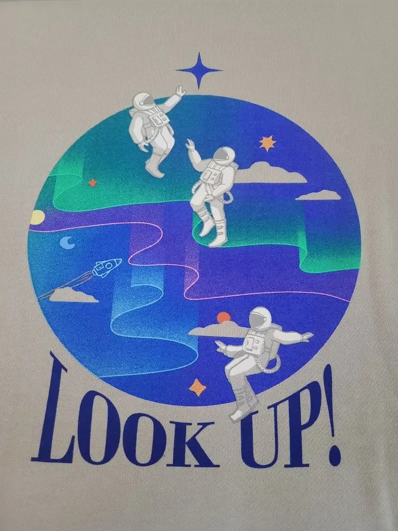
For most logos, slogans and event t-shirts, one to four colours gives a bold, clean result at a good price. If your artwork has more colours than it needs, your Account Manager can suggest which ones could be combined without changing the look. You can see more of our multi colour work in our AS Colour printing guide.
2. Does Every Extra Colour Cost More?
Short answer: yes, because every colour printed needs its own screen and its own pass on the press, but the cost is spread across the whole order.
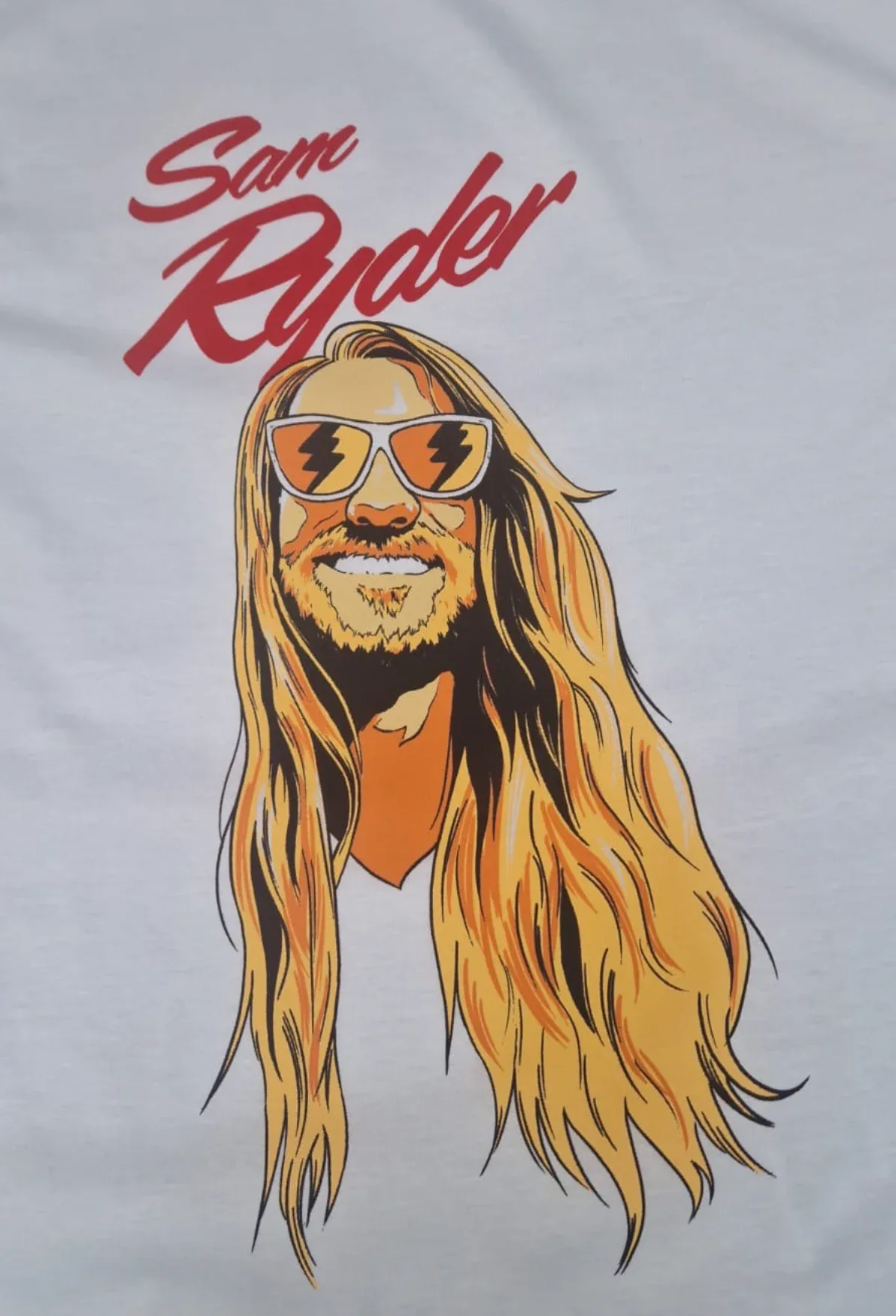
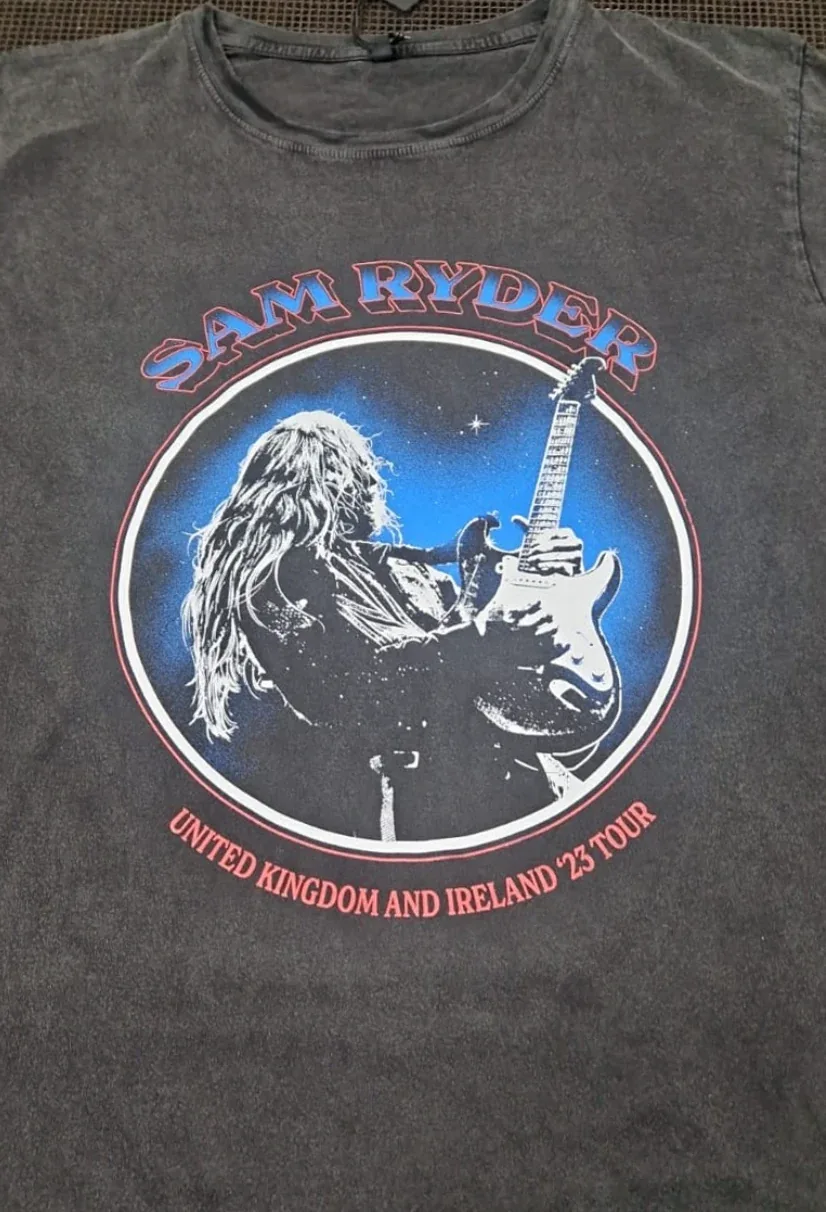
Each screen has to be prepared before printing starts, and each one takes around 15 minutes to set up. That set up is shared across every garment in the order, so the more garments you order, the less each extra colour adds per piece. On a run of 20 t-shirts an extra colour makes a noticeable difference, while on a run of 1000 it adds very little. The Sam Ryder t-shirt below was a 5 colour design printed on an organic EP01 tee from our Earth Positive range.
This is how colour choices typically affect a screen printing order:
| Colour decision | Effect on price | Effect on the print |
|---|---|---|
| One or two colours | Lowest price per garment | Bold and clean, ideal for logos and text |
| Three to six colours | Moderate, falls quickly as quantity rises | Room for illustrations and brand palettes |
| Full process (CMYK) | Depends on the screens your artwork needs | Photographic images and gradients |
| Dark garment | Usually one extra screen for the white underbase | Bright, opaque colours on black and navy |
| Extra print positions | Each position needs its own screens | Front, back and sleeve branding |
Our guide to keeping t-shirt printing costs low has more ways to get the most from every colour.
Get a screen printing quoteor call 0208 064 1315
3. Can You Match Our Exact Brand Colour?
Short answer: yes. Every ink is mixed to your Pantone reference, not the nearest stock colour.
We screen print to Pantone Solid Coated references, so your colour code should end in C. Each ink is mixed to the Pantone formula and checked against a physical Pantone swatch before your order goes onto the press. When we printed these tote bags for Strava, their orange logo was matched to Pantone PMS 1655 C, so it matches their brand orange everywhere else it appears. This is vital for the bigger brands, as even a slight difference can be noticeable.
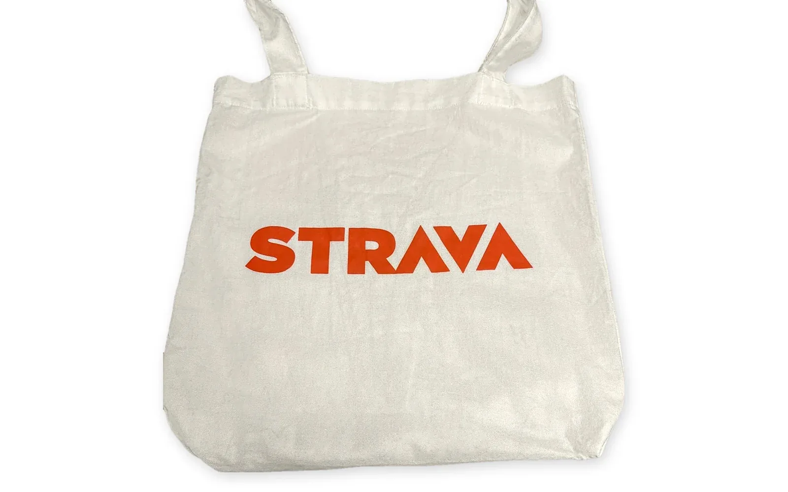
Because the formula never changes, repeat orders are sure to match the first run too. Screen printing gives an exact Pantone match, while DTG, DTF and embroidery get close but cannot match exactly. Our full guide to Pantone colours in screen printing explains how it works, including coated and uncoated references.
4. What If We Do Not Know Our Pantone Colours?
Short answer: send us your logo. If your artwork is vectored, our design team can identify the exact Pantone colours from the file.
The vast majority of brands already have Pantone colours, even if nobody remembers them. Check these first:
- Your brand guidelines. Look for codes starting with PMS or Pantone on the logo or colour palette page.
- Ask your designer. Whoever created your logo will almost always have specified Pantone colours for print.
Screen printing needs vectored artwork, such as an AI, EPS or vector PDF file, and our design team can pick out the exact Pantone colours directly from it. If you only have HEX, RGB or CMYK values, we convert them to the nearest Pantone colour and show it on your free visual proof, so you can check it before anything is printed. Our Pantone guide has a step by step section on how to find your Pantone colour.
5. Will Colours Look the Same on Black and Coloured Garments?
Short answer: not automatically, which is why we print a white underbase (flash) on dark garments.
Colours print most accurately on white and light garments. Screen printing ink is slightly translucent, so on black, navy or other dark colours the garment shows through and the ink looks darker and duller. To stop that happening, we print a layer of white first, called an underbase, and then apply your colours on top, so they remain bright and true. A single colour of white can also be printed bright and clean on its own, as on this black Stanley/Stella Creator 2.0 t-shirt with a jumbo white back print.
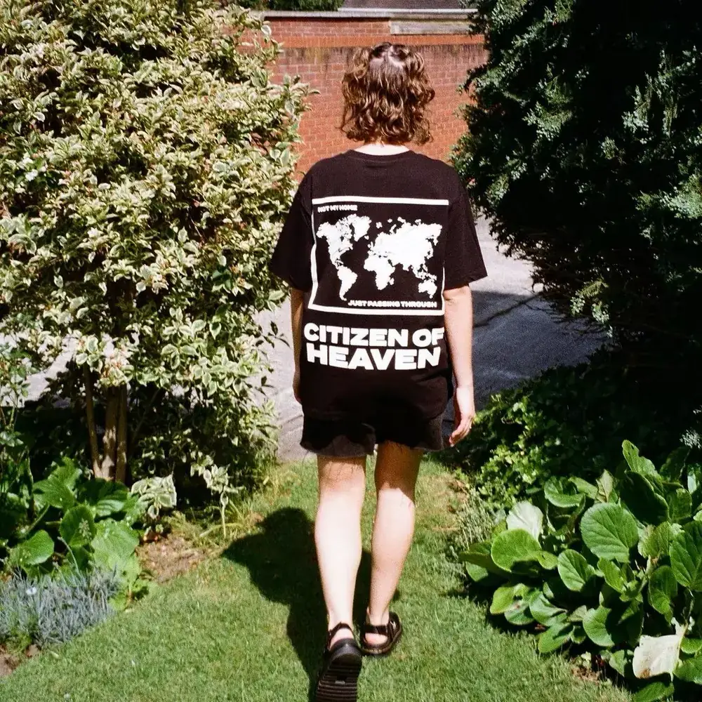
The blank garment itself is important too. Heather and marl fabrics, and textured garments, soften a colour slightly compared with a smooth cotton t-shirt, and a coloured garment can shift how a colour reads next to it. Our guide to which t-shirt is best for printing covers the blanks that give the crispest colour. For more on how garment colour, fabric and ink type change the way a colour looks, see why colours look different on different garments in our Pantone guide.
6. Can Screen Printing Produce Photos, Gradients and Full Colour Designs?
Short answer: yes, using full process (CMYK) printing, although digital printing can be better value for small orders.
Photographic images and smooth gradients are printed with full process (CMYK) screen printing. Our art department separates your design into colour layers made of tiny dots, known as halftones, and those layers merge on the garment to recreate the full range of colours. We need to see the artwork to confirm how many screens it needs. The Sam Ryder tour t-shirt shown below shows how much detail a screen print can hold on a dark garment.
For short runs of full colour artwork, DTG and DTF printing have no set up fees and start at 8 units, so they are often the better choice under 20 pieces. Our guide to DTF vs DTG printing explains which to choose.
7. Why Does My Design Look Different on Screen Than on the Shirt?
Short answer: screens create colour with light, while a garment is printed with ink, so the two never match perfectly. Even the light in the room can affect the view on the screen.
Your monitor and phone display colour in RGB, using red, green and blue light shining out of the screen. Ink on fabric reflects light instead, so very bright on screen colours, especially neons and electric blues, can look calmer once printed. Every screen is also calibrated differently, so the same file can look very different on two devices in the same room, even when beside each other.
That is why we trust a physical Pantone swatch rather than a screen. Your free visual proof, sent within 30 minutes of your order being confirmed, lists the Pantone colour for every part of your design, so you know exactly which inks will be used before anything goes on press.
8. Which Inks Give the Brightest or Softest Colour?
Short answer: plastisol gives the boldest and most accurate colour, while discharge and water based inks give a softer feel.
The ink we use changes both how a colour looks and how the print feels. This is how our main screen printing inks compare:
| Ink | Colour | Feel | Best for |
|---|---|---|---|
| Standard plastisol | The most accurate Pantone match and the best value | Sits on top of the fabric | Logos, brand colours and most orders |
| Discharge | Bleaches the dye out of the garment, so the colour becomes part of the fabric | Very soft | Retail style merch on cotton garments |
| Water based | Slightly more muted | Soft to the touch | White and light garments, and eco friendly orders |
| Full process (CMYK) | Built from colour separations | Depends on the design | Photographs and gradients |
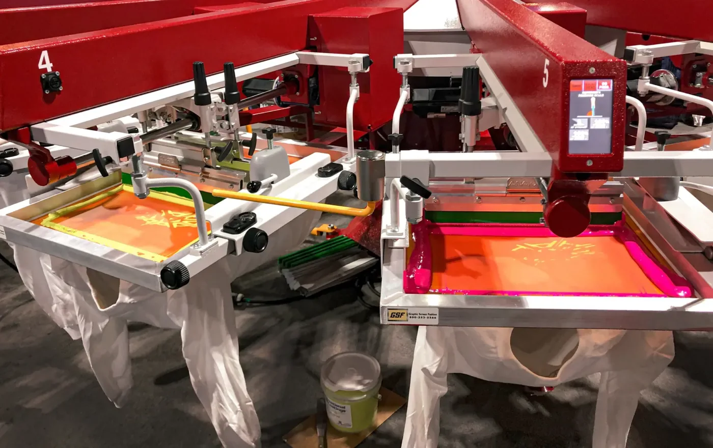
Discharge printing is not something every printer offers, and it is growing more popular every year for merch that needs to feel like a retail piece. We have had more orders for discharge printing in the last 12 months than ever before. Our screen printing page covers every ink we use.
9. Can You Print Metallic, Puff or Glow in the Dark Colours?
Short answer: yes, and they follow the same Pantone rules as standard inks.
- Metallic. Adds shimmer that catches the light, using Pantone metallic references such as 871 C gold and 877 C silver. See what is metallic printing on clothing.
- Puff. Rises as it cures to give a raised, 3D print. The puff additive slightly dilutes the colour, so we print a puff base first and a second layer in your exact Pantone colour on top. Puff printing starts at 25 units, and our puff printing guide has plenty of ideas.
- Glow in the dark. Looks grey in standard light, then glows once the lights go down, which makes it popular for events, bands and nights out.
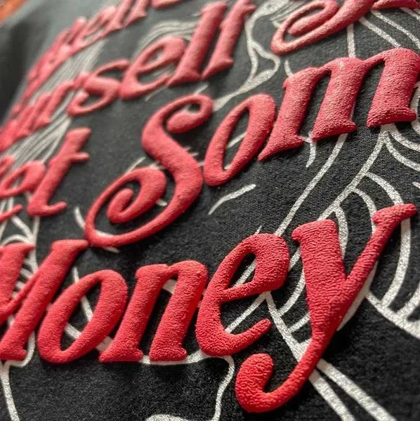
Special effects can be combined with standard colours in the same design, like the red puff lettering above printed over a flat white illustration. They prove to be especially popular for band merch and oversized tees.
10. Will Screen Printed Colours Fade?
Short answer: not when the print is properly cured (which we take care of), the garment is looked after and the care instructions are followed.
After the printing process, every garment passes through an industrial dryer, where the heat cures the ink so it bonds with the fabric. A properly cured screen print is one of the most durable ways to decorate clothing, and the colours stay bright through repeated washing. That is one of the main reasons brands opt for screen printing for uniforms and merch that needs to last.
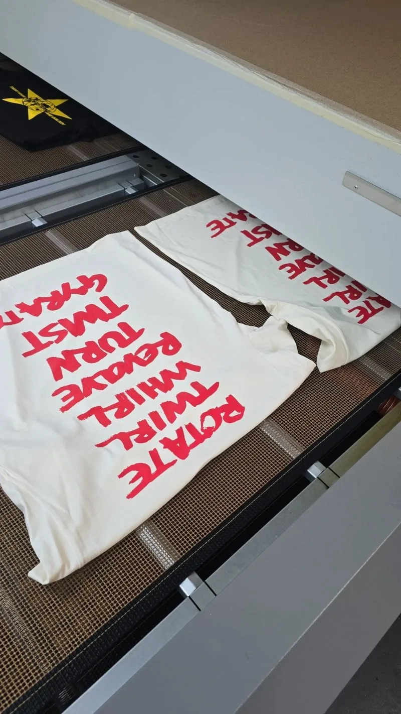
Care makes the biggest difference. Wash your printed garments inside out on a low temperature, avoid the tumble dryer and iron inside out on a low setting. Our wash care guide page provides all the details.
Screen Printing Colour Checklist Before You Place an Order
- Find your Pantone references, ending in C if you have them, or send your vectored logo and our design team will find them for you.
- Count your colours, and ask whether any could be combined without changing the design.
- Choose your blank garment colour early, because dark garments usually need a white underbase. If you are on a budget, white garments are the cheapest option.
- Send vectored artwork, as an AI, EPS or vector PDF file with fonts outlined.
- Be careful with the fine detail, because very thin lines and tiny text might need thickening to print cleanly. Our team checks every file before printing.
- Decide on the ink you wish to use, from standard plastisol to a softer discharge or water based finish.
- Check your visual proof, which lists the Pantone colour for every part of the design. Then check it again. This is the last chance to make any changes.
Not sure where to start? Our custom t-shirts and custom hoodies pages show the garments we print most, and you can compare every method on our printing techniques page.
How It Works
Four steps from first enquiry to delivered order, with one point of contact the whole way through.
Tell Us What You Need
Send over your artwork with any Pantone references, the garments and garment colours you have in mind, your quantity and your deadline. A dedicated Account Manager will come back to you within 15 minutes with pricing and options.
Place Order
We send a free visual proof within 30 minutes of your order being confirmed, showing your design on your chosen garments and listing the Pantone colour for every part of it.
Printed In House
Each ink is mixed to your Pantone reference, every colour gets its own screen, and your order is printed, cured and checked piece by piece by our own team.
Delivered To Your Door
Tracked delivery using the most reliable couriers in the UK, with shipping into Europe and worldwide whenever you need it.
More Quick Answers
What is the minimum order for screen printing?
We recommend screen printing from 20 units per design. For smaller quantities, DTG and DTF printing begin at 8 units with no set up fees.
How long does a screen printing order take?
Screen printed orders, multi colour jobs included, are ready six to seven business days after you approve the artwork. Need it sooner? Ask about express. We will find a way to meet your deadline. Your free visual proof arrives within 30 minutes.
Does a white underbase count as an extra colour?
Yes. On dark garments the white underbase is printed through its own screen before your colours go on top, so it counts as an extra screen when your order is priced. Your Account Manager will tell you if your design needs one. It almost certainly will on a dark garment when screen printed.
Can I use different colours on the front and back?
Yes. Each print position is set up separately, so the front, back and sleeves can all use different colours. Every extra position and colour adds screens, so keeping both down is the easiest way to save.
Will a repeat order be the same colour as the first?
Yes. Because every ink is mixed to a Pantone reference, a repeat order months later matches the first run, which matters for staff uniforms where old and new garments are worn side by side.
What artwork file provides the best results for screen printing colours?
Screen printing needs vectored artwork, such as an AI, EPS or vector PDF file, ideally with your Pantone colours already set and fonts outlined. If you only have a flat image, send it over and our design team will advise on getting it redrawn as vectored artwork before printing.
Final Thoughts
Getting colour right in screen printing comes down to a few decisions: how many colours you want printed, your Pantone references, your garment colour and the ink you choose. Make those early and your prints will look the way your brand should, on every garment and every repeat order. Choosing the right printer matters as much as the method, and our guide to what to look for in a printing company covers the questions worth asking.
Send us your artwork and any brand guidelines and we will talk you through what is achievable. Email hello@1worldprint.co.uk or call us on 0208 064 1315.
Want your colours right first time?
hello@1worldprint.co.uk · 0208 064 1315
Locations
20-22 Wenlock Road
London
N1 7GU
0208 064 1315
Visits by appointment onlyManchester Address
First Floor, Swan Buildings
20 Swan Street
Manchester
M4 5JW
0161 457 6080
Visits by appointment only