
Pantone Colours in Screen Printing: How We Match Your Brand Colours Exactly

Published
Pantone colours, also known as PMS colours, are how brands make sure their exact shade of green, red or blue looks the same on a t-shirt, a sign and a website, whoever is printing it. This guide explains how Pantone colour matching works in screen printing, which references to send the printer, and how to get your brand colours right on every single garment colour.
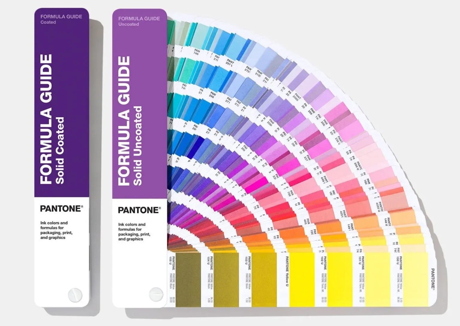
When we screen print your design, each colour printed is mixed to a Pantone reference rather than taken from the nearest stock ink, so your logo comes out in your brand colour, not something resembling it. Screen printing starts at 20 units per design, with a standard turnaround of six to seven business days from artwork approval.
Key points
- Pantone colours are numbered, standardised shades from the Pantone Matching System, known as PMS.
- We screen print to Pantone Solid Coated references, so your colour code should end in the letter C.
- Each ink is mixed to your Pantone reference and checked against a physical swatch before production begins.
- HEX, RGB and CMYK colours are converted to the nearest Pantone, and shown on your free visual proof for you to check.
- Screen printing gives an exact Pantone match. DTG, DTF and embroidery get close, but can't match exactly. Embroidery uses the closest thread to your Pantone colour.
In this guide
- What Are Pantone Colours?
- Why Pantone Colour Matching Matters for Your Brand
- How Pantone Matching Works in Screen Printing
- Pantone Coated vs Uncoated: C or U?
- How to Find Your Pantone Colour
- Pantone vs CMYK vs RGB
- Pantone Matching by Print Method
- Why Colours Look Different on Different Garments
- Pantone Matched Printing: Minimums and Delivery
- How to Order Pantone Matched Prints
- Pantone Colour Matching FAQs
What Are Pantone Colours?
Pantone colours are standardised, numbered colours from the Pantone Matching System, usually known as PMS colours. Introduced in 1963, the system gives every colour a unique reference, such as Pantone 485 C, and a published ink formula. Because the formula will never change, a printer in London and a printer in Madrid can mix the same Pantone colour and get the same result.
In print, Pantone colours are known more commonly as spot colours. Instead of building a colour out of tiny dots of four process inks, a spot colour is mixed in advance as a single, solid ink. That is exactly how screen printing works: each colour in your design is mixed separately and printed through its own screen, which is the reason screen printing is the best way to reproduce Pantone colours on clothing.
Why Pantone Colour Matching Matters for Your Brand
Think of any major brand and you picture a colour before you picture anything else. McDonald's, for example, is famously associated with Pantone 485 red and Pantone 123 yellow. When a brand colour is ever so slightly off on printed merchandise, people often notice that something looks wrong, even if they can't say why.
Pantone colour matching keeps your brand consistent across everything you produce:
- Across products. Your hoodies, t-shirts, tote bags and promotional merchandise all match your signage and packaging.
- Across your supply chain. Give every supplier the same Pantone reference and you get the same colour, whoever is printing.
- Across repeat orders. A reorder months later matches the first run, which matters for workwear and staff uniforms where new and old garments are worn side by side.
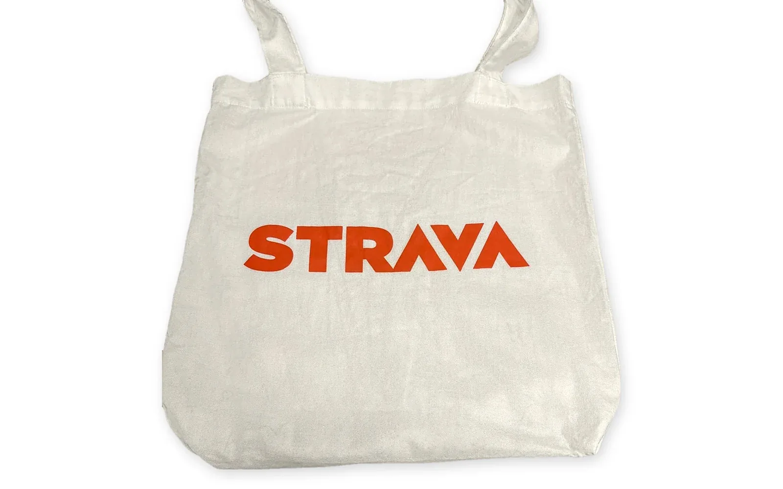
When we printed these tote bags for Strava, their orange logo was matched to Pantone PMS 1655 C, so it matches their brand orange everywhere else it appears.
How Pantone Matching Works in Screen Printing
Pantone matching in screen printing comes down to mixing the right ink and checking it properly before production begins. At 1WorldPrint it works like this:
- You send your Pantone references. Supply them with your artwork, or send your logo and our design team will find them for you.
- We confirm the colours on your visual proof. Your free visual proof, sent within 30 minutes of your order being confirmed, lists the Pantone colour for every part of the design.
- Each ink is mixed to the Pantone formula. The ink for every colour is mixed to match your reference, rather than using the nearest ready made colour.
- The colour is checked before production. The mixed ink is checked against a physical Pantone swatch before your order goes onto the press.
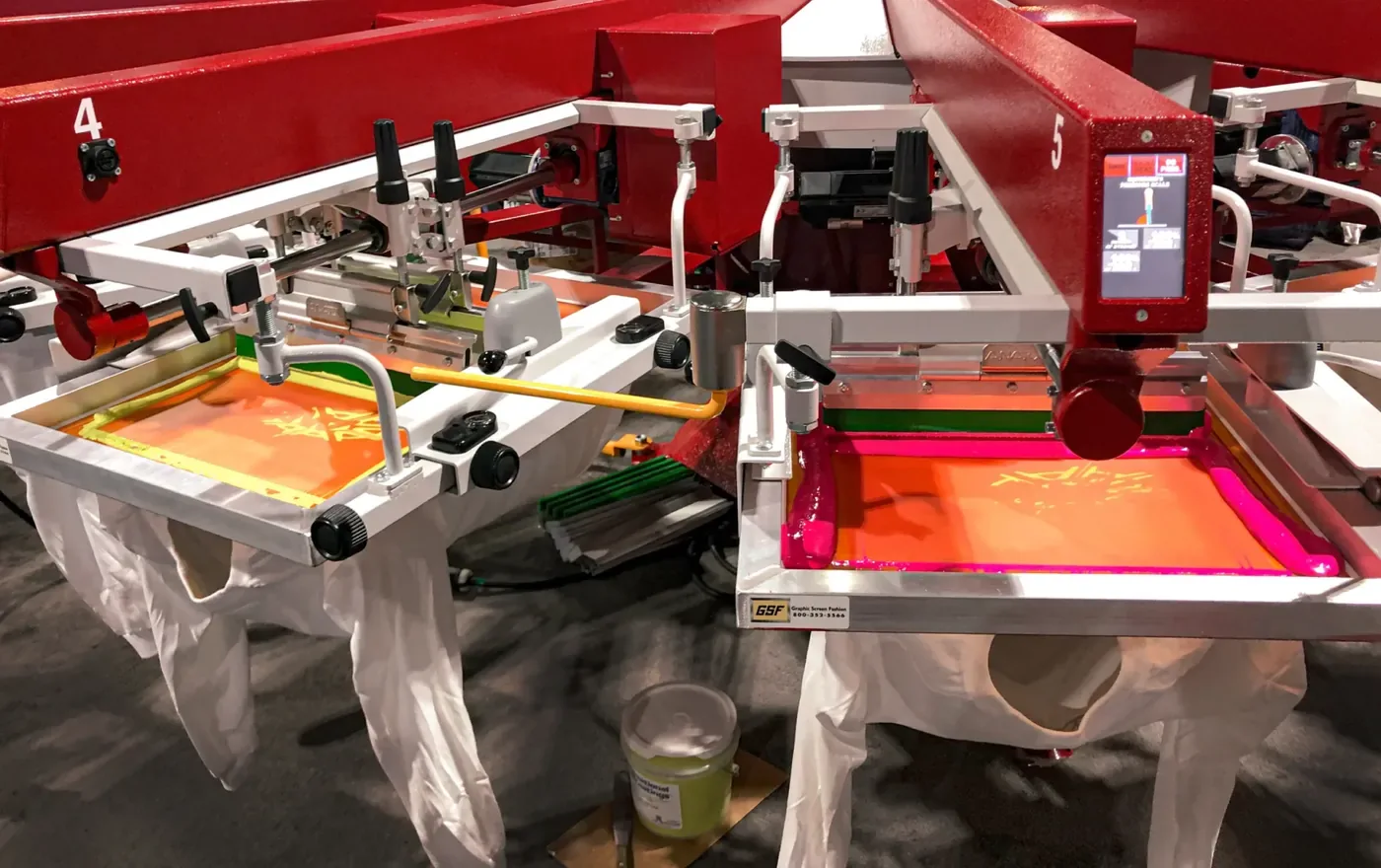
Special effect inks follow the same rule. For puff printing, the puff additive slightly dilutes the colour, so we print a puff base first and a second layer in your exact Pantone colour on top. Metallic printing uses Pantone metallic references such as 871 C gold and 877 C silver.
Pantone Coated vs Uncoated: C or U?
Every Pantone colour is printed in two versions of the guide. The coated guide is printed on glossy paper and the colour number ends in C. The uncoated guide is printed on matte paper and the number ends in U. The same number looks different in each: coated swatches look brighter and more saturated, while uncoated swatches look softer and flatter. We always ask for coated Pantone references.
At 1WorldPrint we use the Pantone Solid Coated guide for screen printing, so your colour should end in C. A coated swatch is the closest representation of how plastisol screen printing ink looks on a garment. If your brand guidelines only list a U colour, send it over and we will match it to the closest coated equivalent.
You may also see references ending in TCX or TPX. These come from Pantone's textile system and are mostly used for dyeing fabric and yarn. We can work from them too, matching each one to the closest Solid Coated ink.
How to Find Your Pantone Colour
The vast majority of brands already have Pantone colours, even if nobody remembers them. Try these, in order:
- Your brand guidelines. Look for colour codes starting with PMS or Pantone, normally located on the logo or colour palette page.
- Your designer. Whoever created your logo will almost certainly have specified Pantone colours for print.
- The Pantone colour finder. Pantone Connect converts HEX, RGB and CMYK values into the closest Pantone colour. Remember that colours look different on a backlit screen, so treat a screen conversion as a starting point.
- Adobe Illustrator. Illustrator's recolour artwork tool can swap each colour in your logo for its nearest match from the PANTONE+ Solid Coated colour book. The newer versions of Illustrator need a Pantone Connect subscription for the full Pantone libraries.
- Send us your logo. If none of that works, send us your logo files and our design team will find the closest Pantone match for you.
Vectored artwork with the Pantone colours already set, as an AI, EPS or PDF file with outlined fonts, is ideal. Our guide to colour in screen printing answers the other questions brands ask before ordering.
Get a Pantone matched quoteor call 0208 064 1315
Pantone vs CMYK vs RGB
Pantone, CMYK and RGB are the three different ways of describing colour, and they don't convert perfectly into one another.
| Colour system | What it is | Where it is used | Accuracy on clothing |
|---|---|---|---|
| Pantone (PMS) | Pre mixed spot colours, each with its own formula | Logos, brand colours, screen printing | Exact and repeatable |
| CMYK | Cyan, magenta, yellow and black mixed as tiny dots | Full colour print, photos, DTG and DTF | Close, but varies by printer and fabric used |
| RGB and HEX | Red, green and blue light | Screens, websites and social media | Converted to CMYK or Pantone before printing |
For a logo or a brand colour that simply has to be right, Pantone is the one to use. CMYK is best suited to photographic and full colour designs, which is where digital printing comes into its own.
Pantone Matching by Print Method
How closely your Pantone colours can be matched depends on which print technique is used to decorate the garment.
| Print method | Pantone match | Minimum order |
|---|---|---|
| Screen printing | Exact. Each ink is mixed to your Pantone formula | 20 units |
| Puff printing | Exact, using a puff base and a Pantone top layer | 25 units |
| Embroidery | Very close. Matched to the nearest thread shade | 8 units |
| Direct to garment | Close. Built from CMYK inks | 8 units |
| Direct to film | Close. Built from CMYK inks | 8 units |
If exact brand colour is the priority, go for screen printing. If your design is a photograph or has hundreds of colours, DTF or DTG will produce better results, and our guide to DTF vs DTG printing explains which to pick.
Why Colours Look Different on Different Garments
A Pantone reference is printed on white paper, so a few things can change how the same ink looks on a garment:
- Garment colour. Colours print most accurately on white or lighter garments. On black or navy, ink looks darker, so we print a white underbase (AKA flash) first, then print your Pantone colour on top of the underbase.
- Fabric. Heather and marl fabrics, and textured garments, dilute a colour slightly compared with a smooth cotton t-shirt. Our guide to the best clothing brands to personalise covers the blanks that print best.
- Ink type. Plastisol ink gives the most accurate Pantone match. Water based inks sink into the fabric for a softer feel, but look slightly more muted than plastisol.
- Screens and lighting. Your monitor, your phone and the light in the room all change how a colour looks, which is why a physical Pantone swatch is the reference we trust the most.
The number of colours in your design also changes the price, because every colour requires its own screen. Our guide to keeping t-shirt printing costs low explains how to get the most from each printed colour.
Pantone Matched Printing: Minimums and Delivery
We screen print Pantone matched custom t-shirts, hoodies, sweatshirts, polos, workwear and tote bags for businesses, clubs, events and bands. Every order is printed in house and sent out on tracked delivery anywhere in the UK, with shipping into Europe and worldwide when you need it.
If you are ordering across several products, give us the same Pantone references for every item, so your t-shirts, totes and workwear all match each other. If your design has more colours than your budget allows, tell us which brand colour matters most and your Account Manager can suggest which of the others could be combined or dropped.
Custom screen printing starts at 20 units per design, with a standard turnaround of six to seven business days from artwork approval and express turnaround available when the date is tight. A dedicated Account Manager handles your order from start to finish, and 30/60 day credit terms are available for businesses.
How to Order Pantone Matched Prints
Four steps from first enquiry to delivered order, with one point of contact the whole way through.
Tell Us What You Need
Send over your artwork, Pantone references, garment, quantity and deadline. A dedicated Account Manager will come back to you within 15 minutes with pricing and options.
Place Order
We send a free visual proof within 30 minutes of your order being confirmed, listing the Pantone colour for every part of your design.
Printed In House
Every ink is mixed to your Pantone references and checked before printing, then your order is printed, checked piece by piece and packed by our own team.
Delivered To Your Door
Tracked delivery using the most reliable couriers in the UK, with shipping into Europe and worldwide whenever you need it.
Pantone Colour Matching FAQs
What is a Pantone colour?
A Pantone colour is a numbered, standardised colour from the Pantone Matching System, often called PMS. Each number has a published ink formula, so a printer anywhere in the world can mix the same shade and your brand colour looks the same on every order. This is vital for brands that print across many different continents.
What does the C or U after a Pantone number mean?
C stands for coated and U for uncoated. The same Pantone number is shown printed on glossy coated paper and on matte uncoated paper, and it will look brighter on coated stock. For screen printing we work to the Pantone Solid Coated guide, because it is the closest match to how plastisol ink finishes on a garment, so the colour you send to us should end in C. If you only have a U or a textile reference, we will match it to the closest coated colour.
What if I don't know my Pantone colour?
Check your brand guidelines first, or ask whoever designed your logo. If you still can't find it, send us your logo files and we will find the closest Pantone match and show it on your free visual proof before anything is printed.
Can you match a HEX, RGB or CMYK colour?
Yes, by converting it to the nearest Pantone colour. Screen and CMYK colours don't convert perfectly, because a screen is backlit and ink on fabric is not, so we will confirm the Pantone reference we are using on your visual proof.
Will my Pantone colour look the same on a black t-shirt?
Not without help. Ink on a dark garment looks darker and duller, so for bright colours on black or navy we print a white underbase first (flash) and your Pantone colour on top. Colours print most accurately on white and light garments.
Can DTG, DTF or embroidery match Pantone colours?
They can get close, but not exact. Direct to garment and direct to film printing build colours from CMYK inks, so a Pantone shade is approximated, and embroidery is matched to the nearest available thread shade. If an exact brand colour matters, screen printing is the method to choose. With embroidery we use the closest thread to your Pantone colour.
Will repeat orders be the same colour?
Yes. Because we print to the same Pantone reference every time, a reorder weeks, months or years later matches the first run, which is the exact reason why brands use Pantone for uniforms and merchandise.
What is the minimum order for Pantone matched screen printing?
Screen printing starts at 20 units per design, and every colour is mixed to a Pantone reference as standard. The standard turnaround is six to seven business days, with express turnaround available on request.
Need your brand colours matched exactly?
hello@1worldprint.co.uk · 0208 064 1315
Locations
20-22 Wenlock Road
London
N1 7GU
0208 064 1315
Visits by appointment onlyManchester Address
First Floor, Swan Buildings
20 Swan Street
Manchester
M4 5JW
0161 457 6080
Visits by appointment only